Challenge
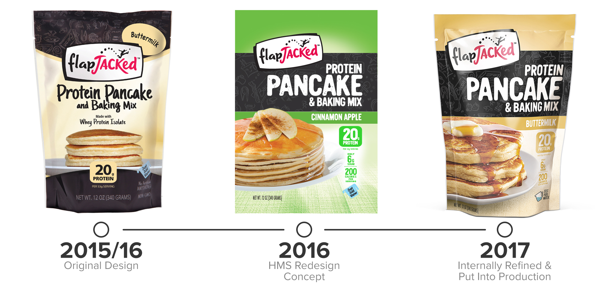
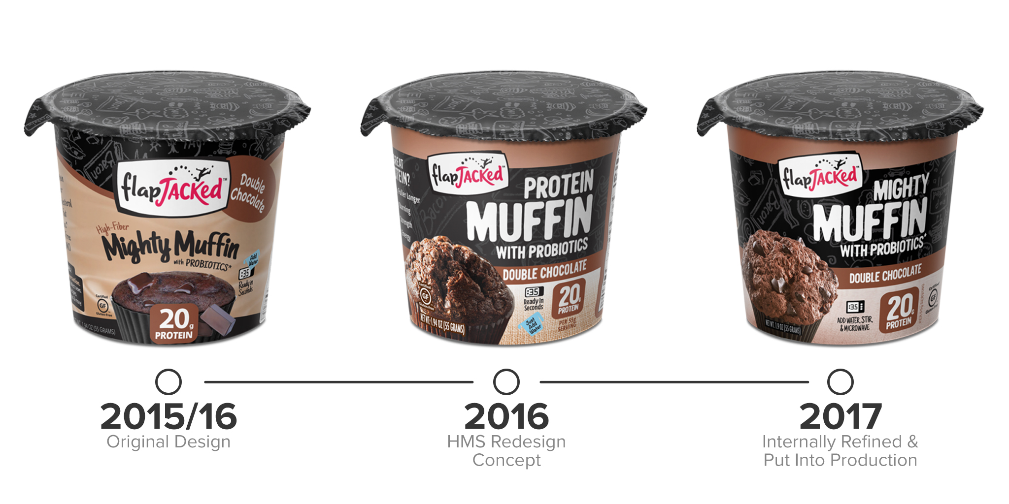
Evolution of Flagship Products
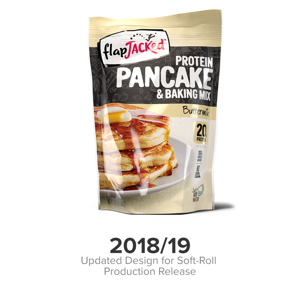
Protein Pancake
& Baking Mix
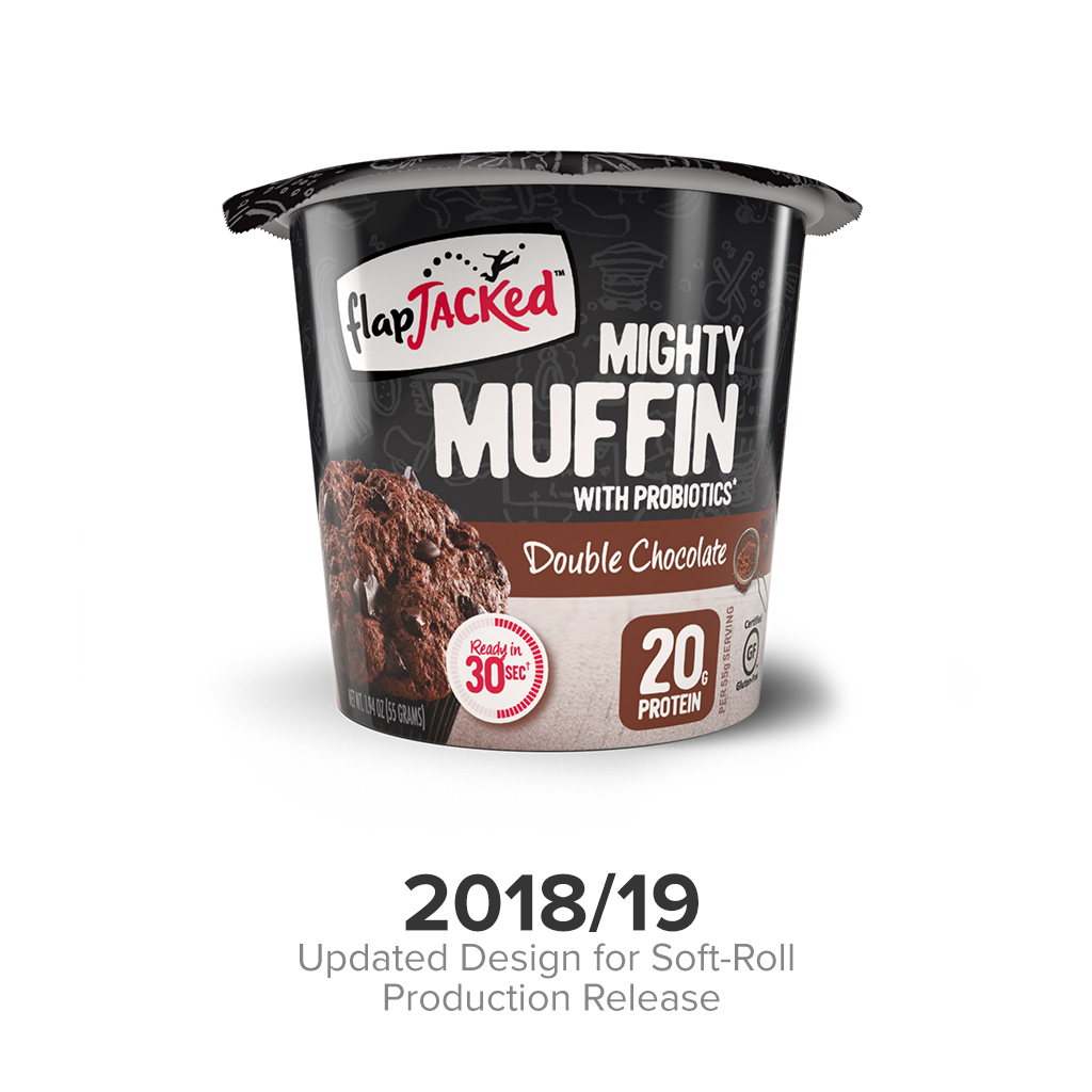
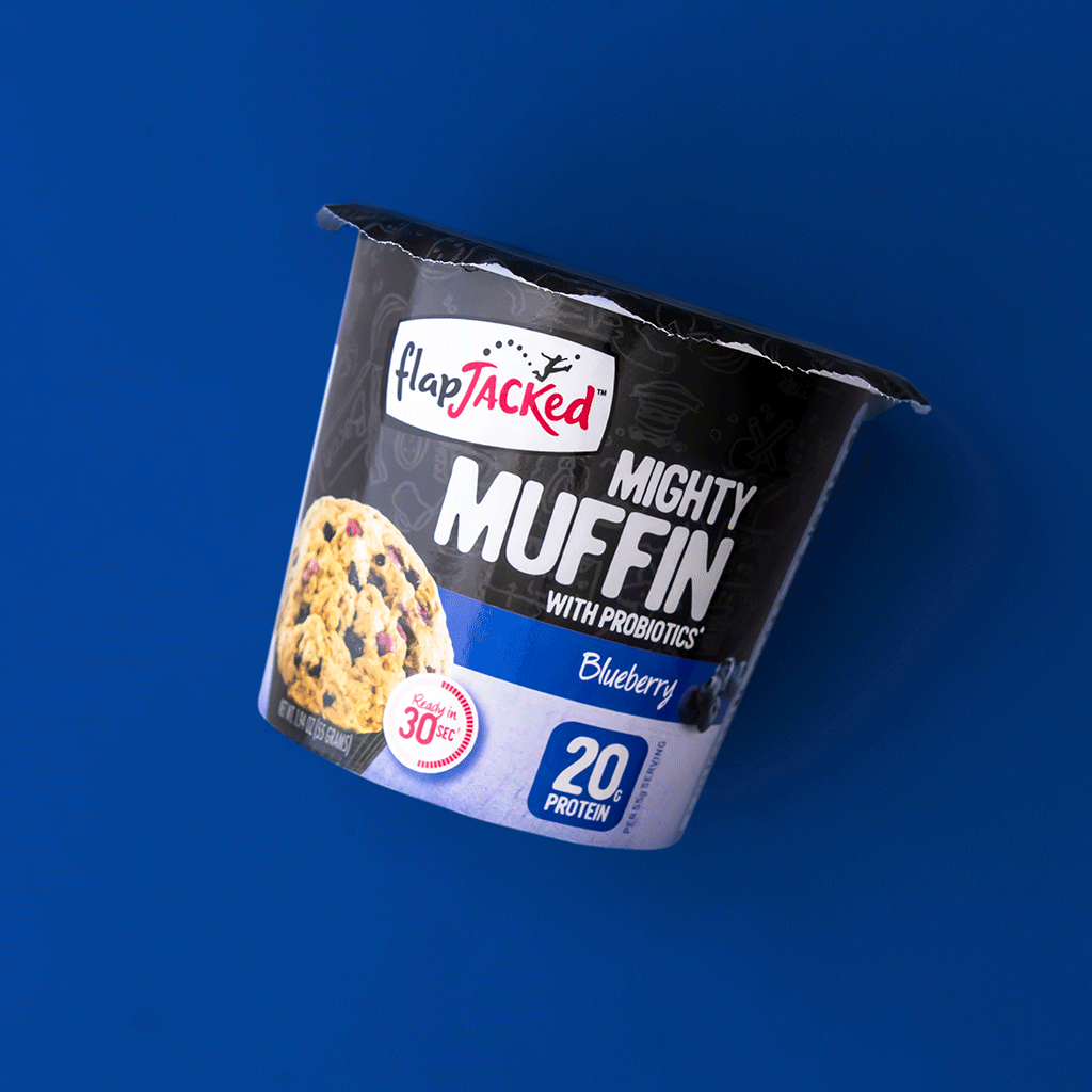
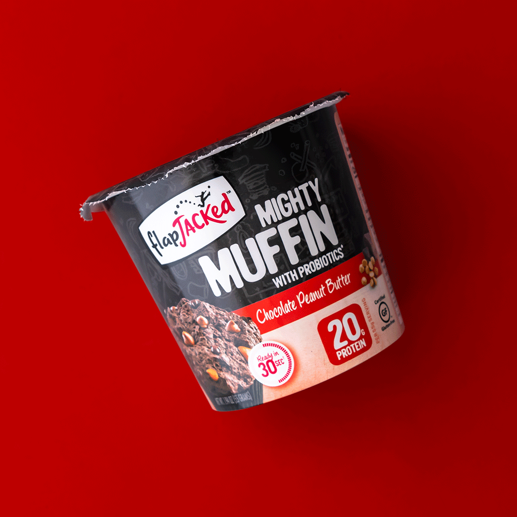
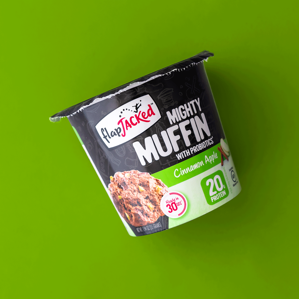
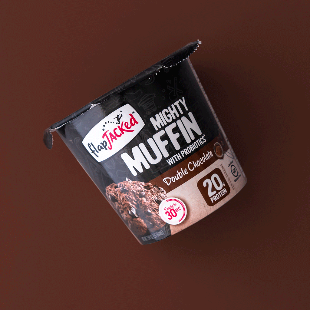
Mighty Muffin®
Design Details
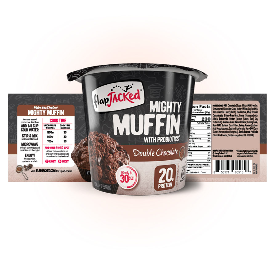
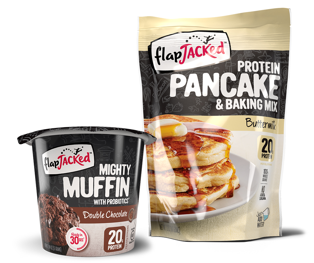
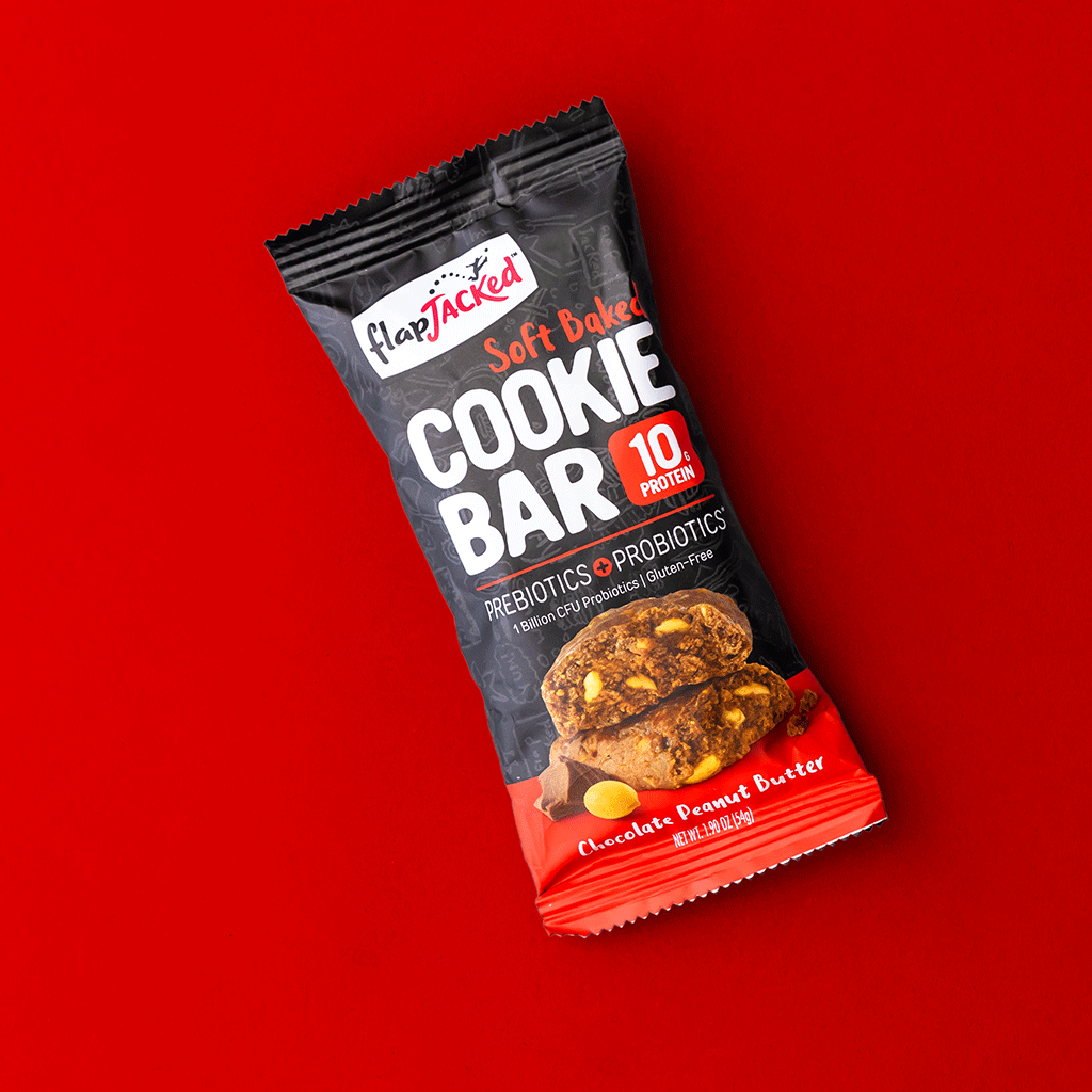
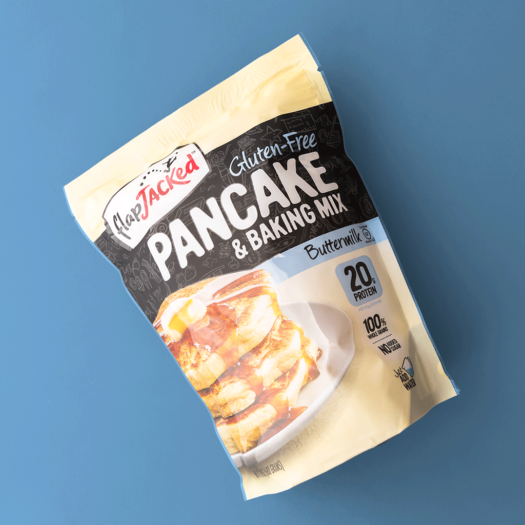
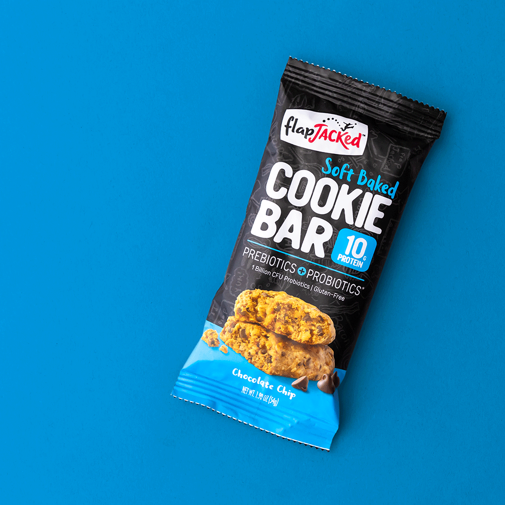
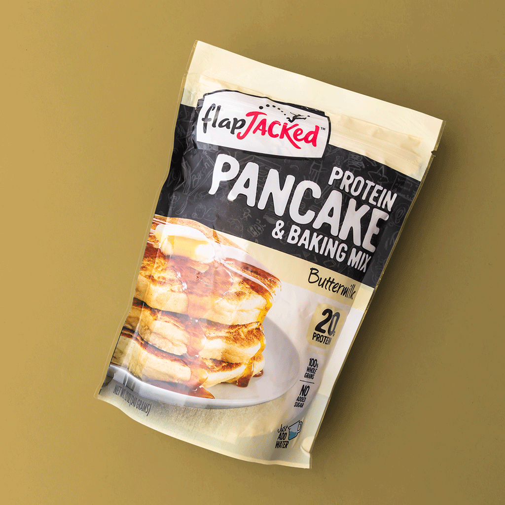
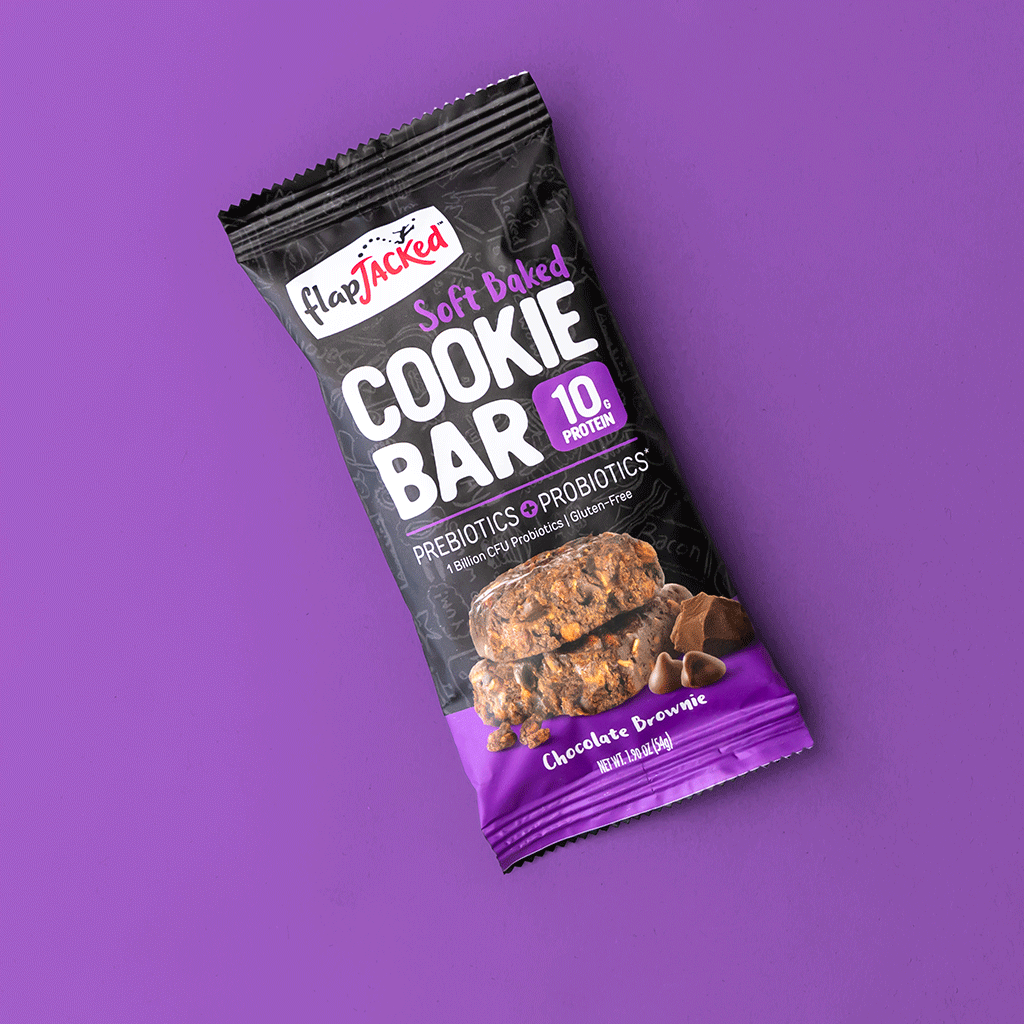
When thinking about placement on retail shelves it is important to consider how the package itself shops and what emphasis is placed where. The big three questions we kept in the back of our mind were Who [am I], What [am I], and Why [am I right for you].
Studies show that the American consumer has a tendency to read packaging left-to-right and top-to-bottom with their eyes landing and honing into the lower right corner of a package. We employed this knowledge by prominently placing our brand top left and ensuring our main POD, protein content, was placed in the lower right of each PDP.
Who
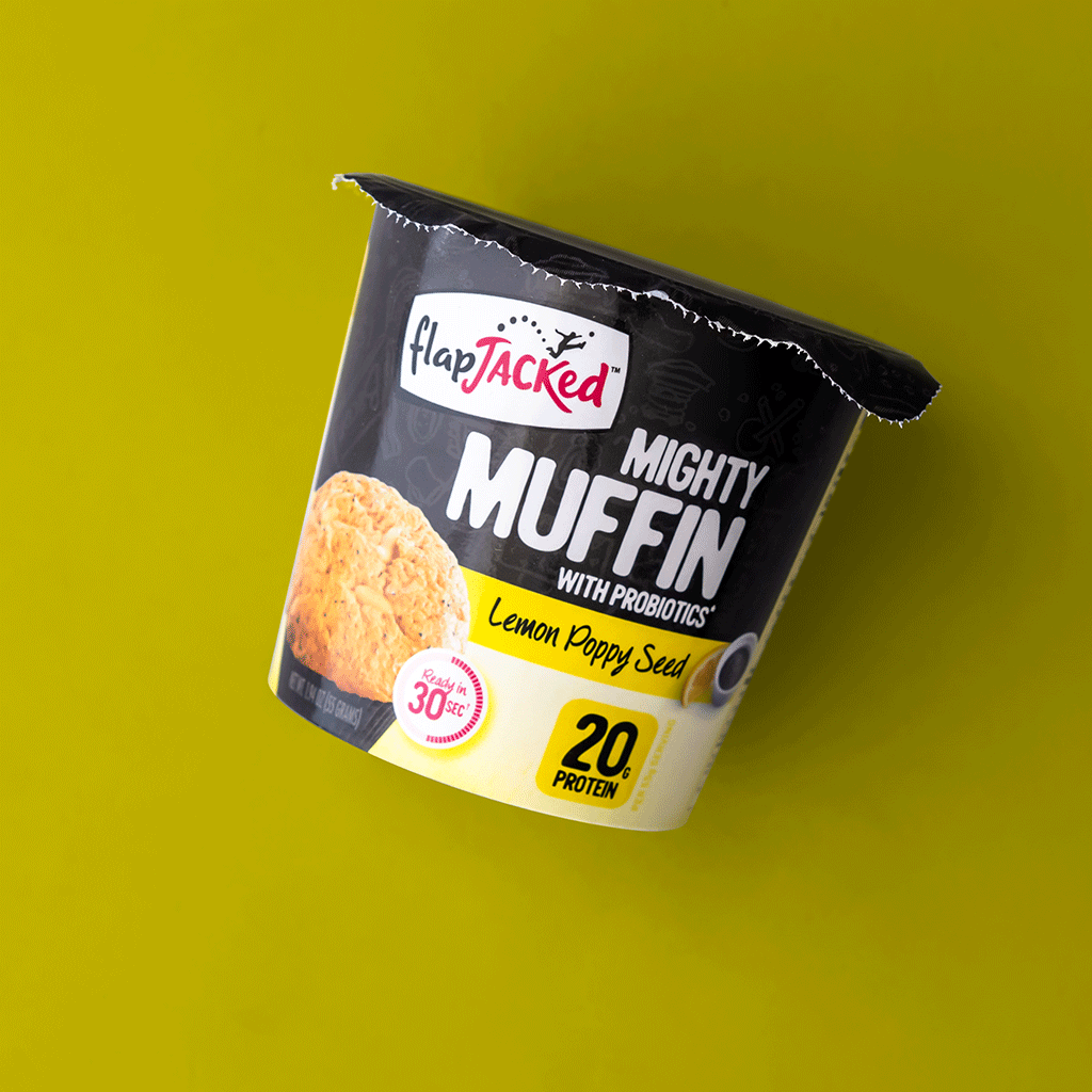
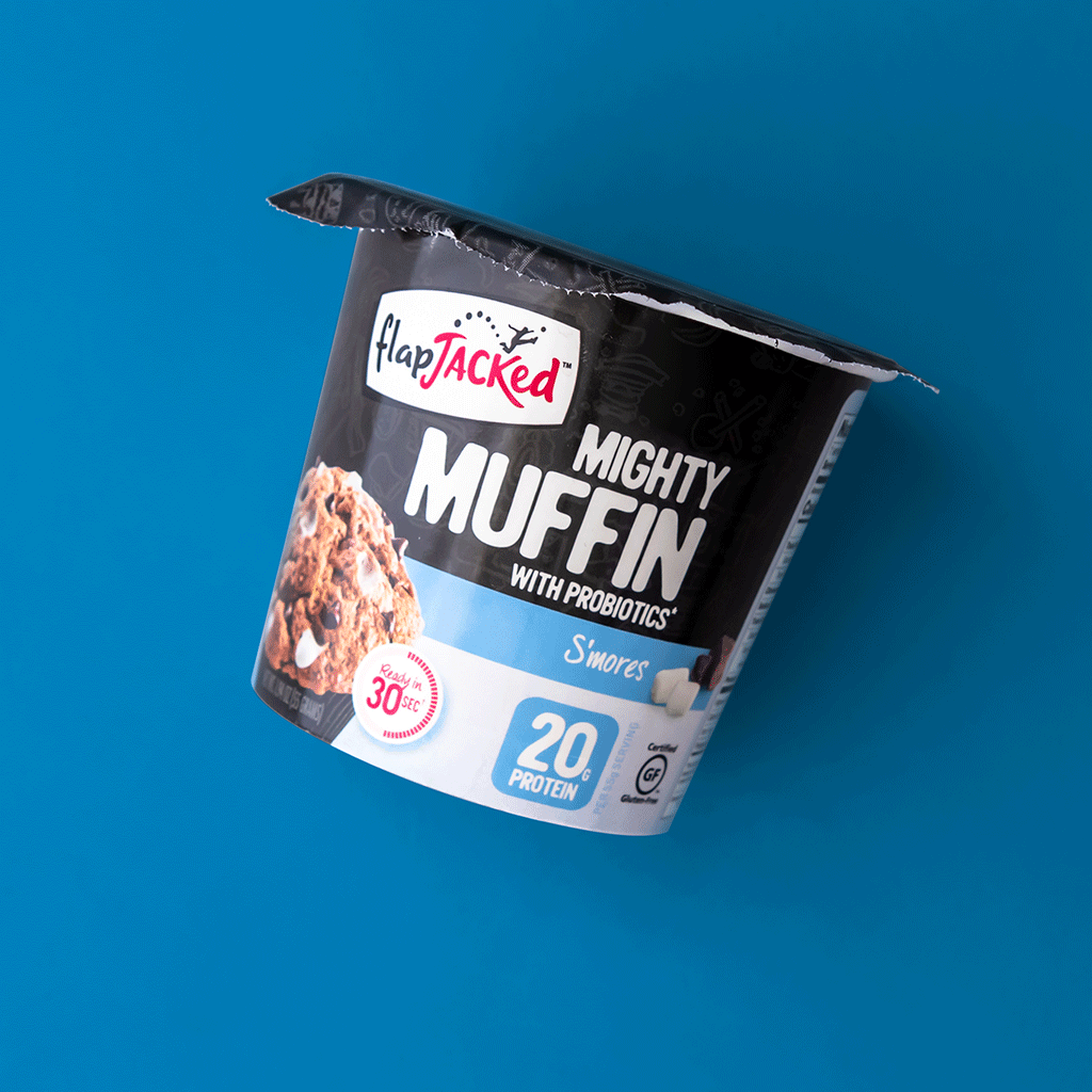
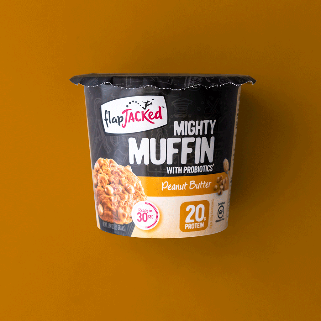
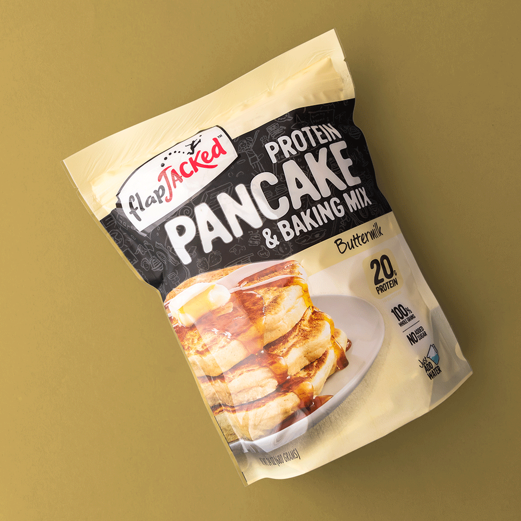
We led big with Brand by ensuring the logo was visible even on a low shelf placement and rocking it ever so slightly off of the product name to lockup our Who.
What
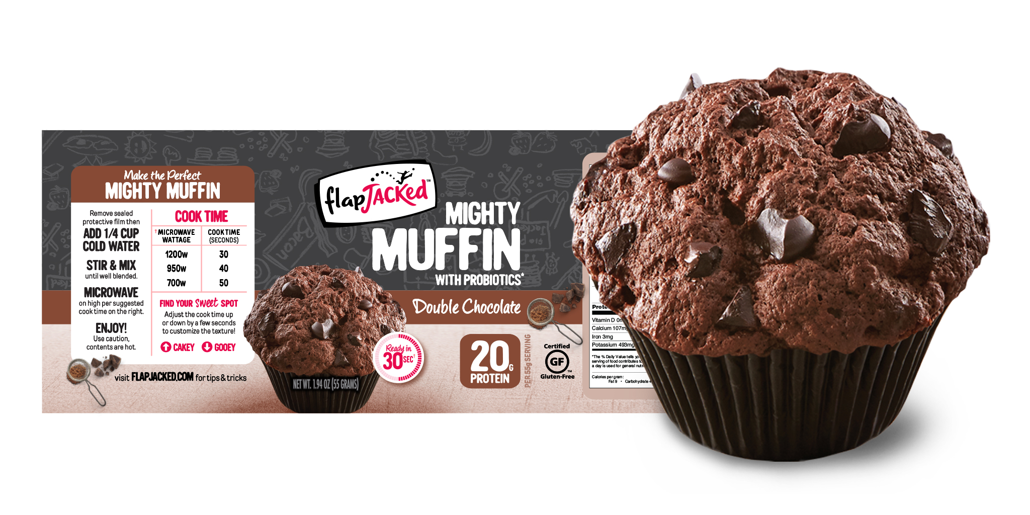
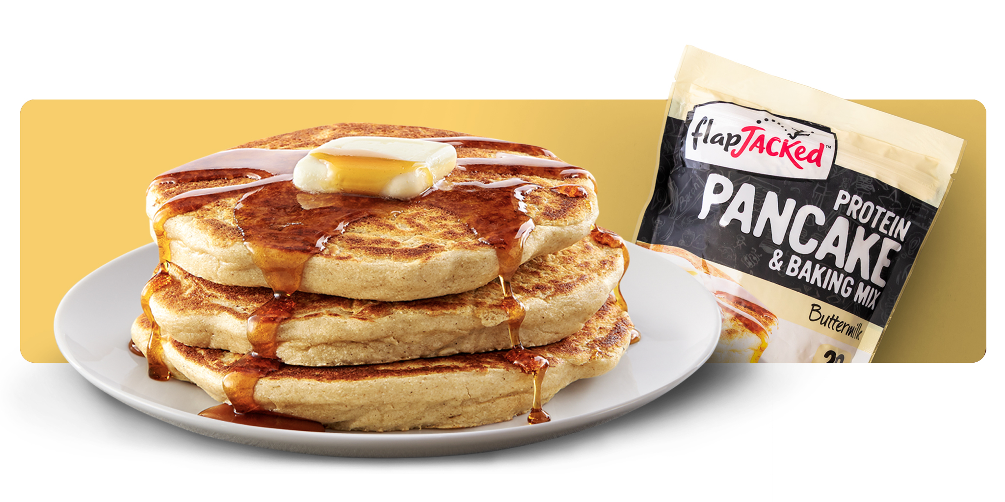
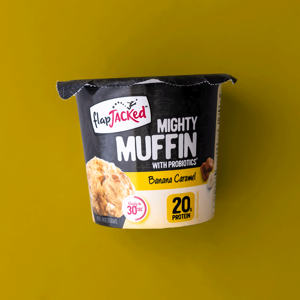
Emphasis was placed on the What by making the product name large with high contrast white-on black type. The What was reinforced through flavor color and large PDP visuals.
Why
Finally, we answered the Why by employing our signature protein “Chicklet” that was present on the original package design. We further answered by flanking the “Chicklet” with relevant, tertiary PODs.
Visualize the Taste
Stand Out with Color
View More Work


