Prev
 0
0
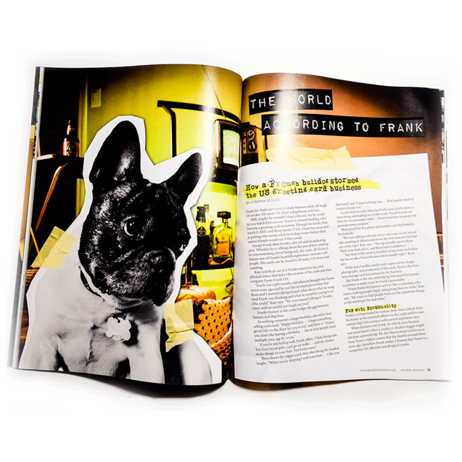
The World According to Frank
07 January 2020
Next
 0
0
Decagon Devices Product Kiosk
10 January 2020

Challenge
Solution
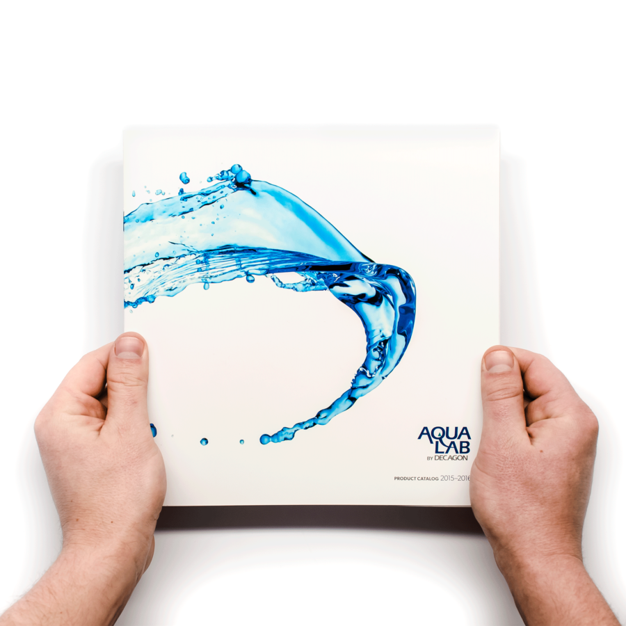
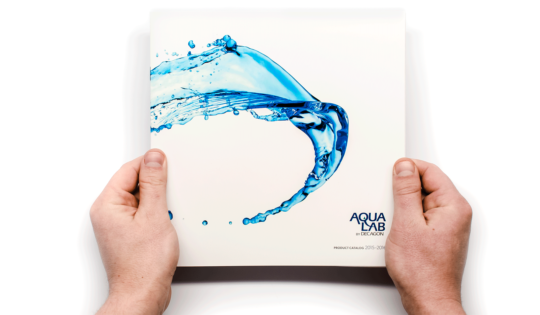
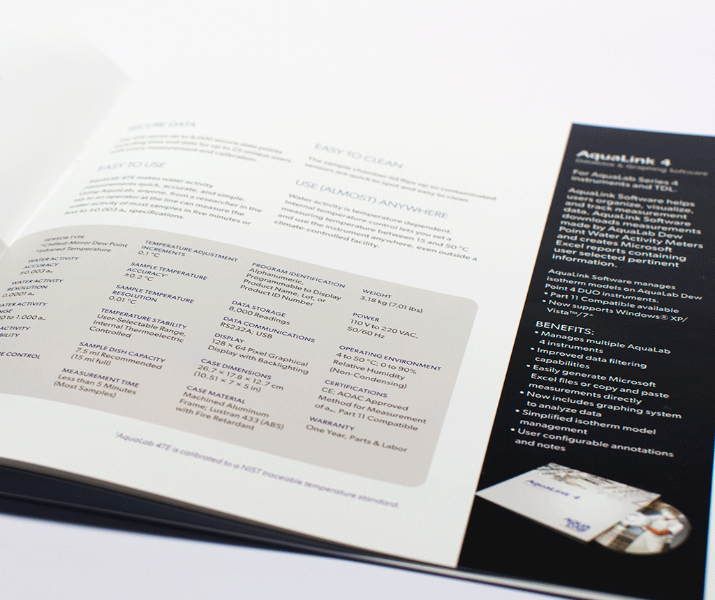
Using new photography and overall design to my advantage, the resulting piece is not only cohesive throughout, but more importantly, the informative tool it needs to be. It has has even excited customers to comment on how they love the new catalog.
Design Details
Refined Organization
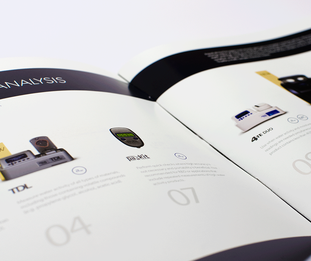
As you open the catalog, a strategically designed spread welcomes you to what not only functions as a brief overview of the products, but also as a table of contents. The order of which was advised upon by the sales staff based on how they wanted the customer to view the product line.
New Photography
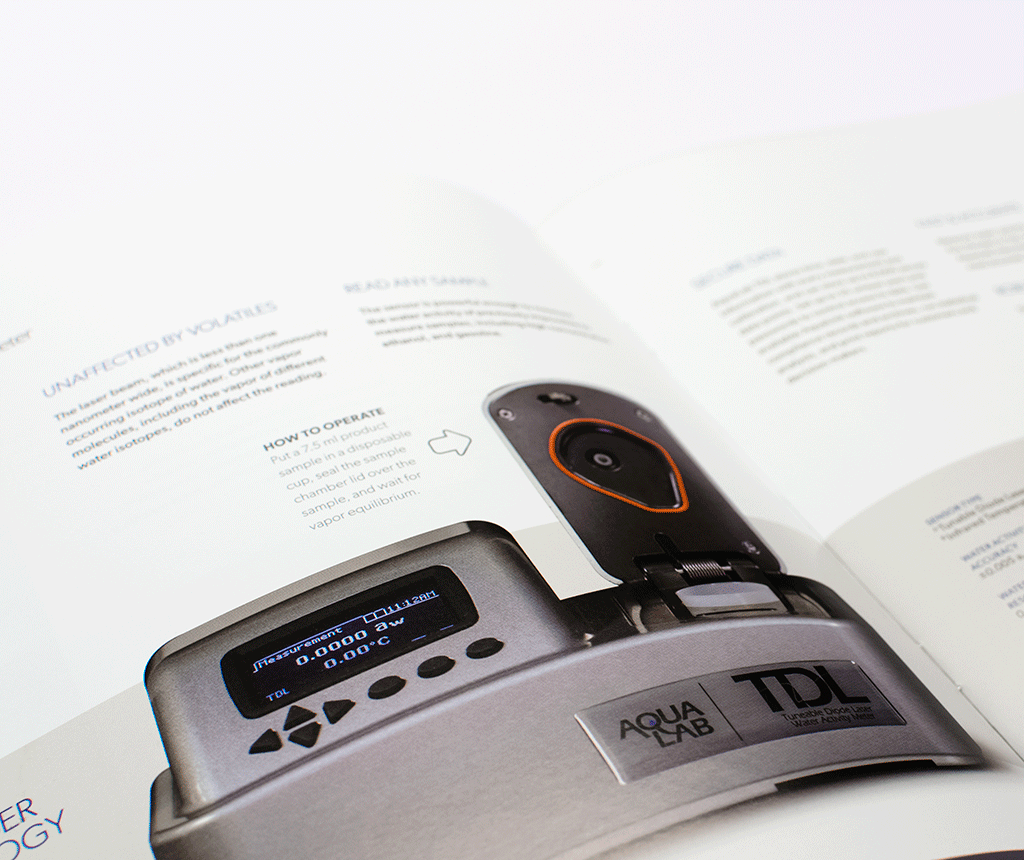
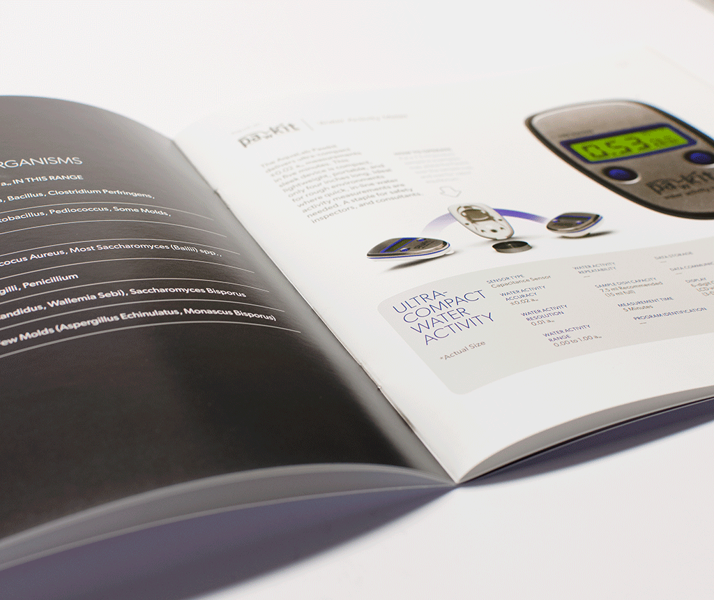
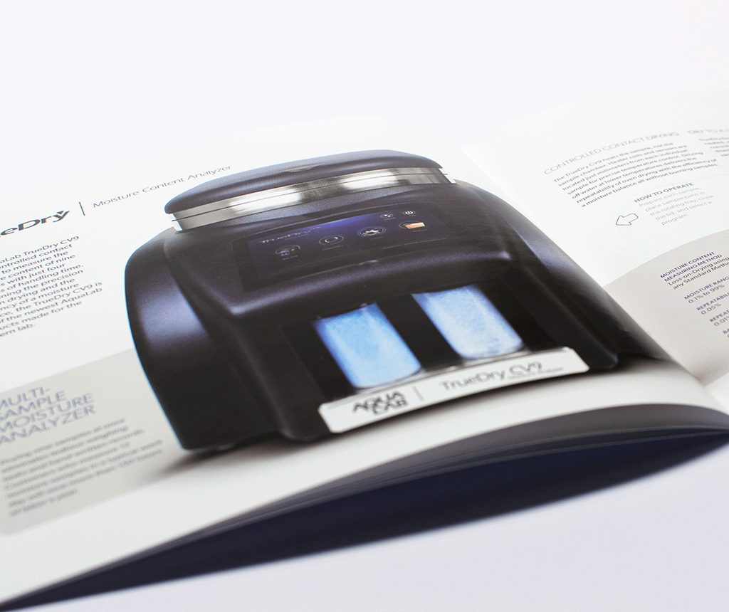
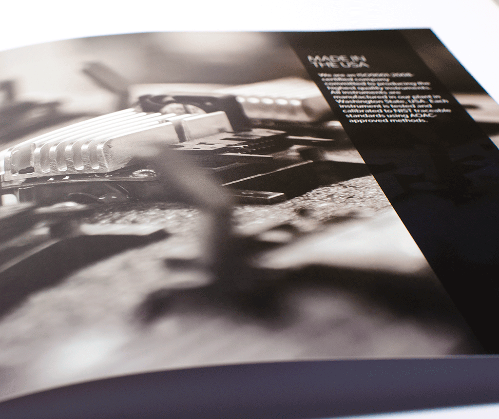
To function properly as an informational tool, we needed to use a style of photography that didn’t just represent the product, but also communicated that these are sophisticated and refined scientific instruments. We achieved this by isolating the products in a straight line of view that is as refined looking as the products are scientifically sophisticated.
Improved Reader Experience
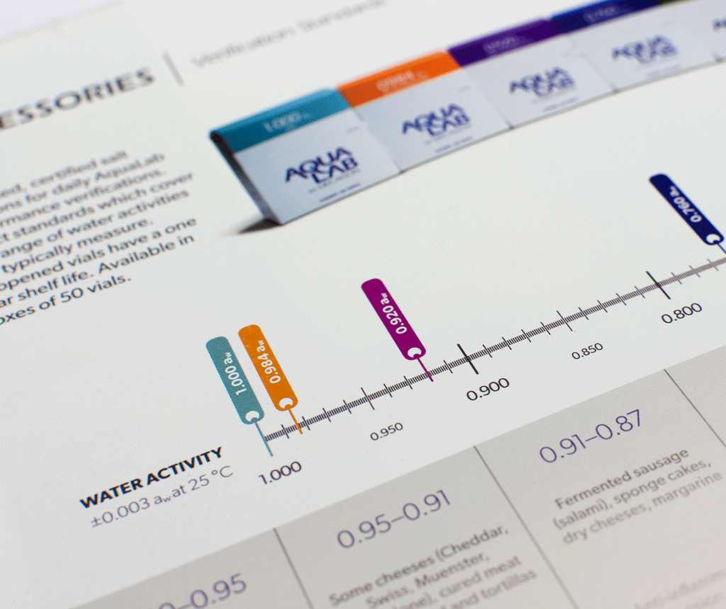
Using consistent page layouts to my advantage, the resulting catalog improved the experience of both the sales team and the customers. Placing the right information in the correct spot, they are not distracted with having to scavenge for what they are looking for.
Creative Direction: Wayne Carey
Art Direction: Nick Belotti
Layout & Design: Nick Belotti
Product Photography: Cody Madison
Photo Editing: Nick Belotti
Copy: Julia Mumford & AquaLab Product Managers
This project was created for Decagon Devices, Inc, the copyright holder, and is used here with their explicit permission.
View More Work

